Role: UI Designer
Length: 1 Week
Tools: Adobe XD, Figma
Problem Statement
There are currently 898 Pokemon and 7 different regions in the Pokemon Universe. Many of the Pokdex mobile applications on the digital market have not been updating their content and data in regards to keeping up with the introduction of new pokemon and their respective regions. Users are frustrated because they are not getting current data on the newest pokemon.
Initial Designs
I created the first design drafts so that I could visually sketch out some ideas on how would want the layout, data, typography, and colors to look like.
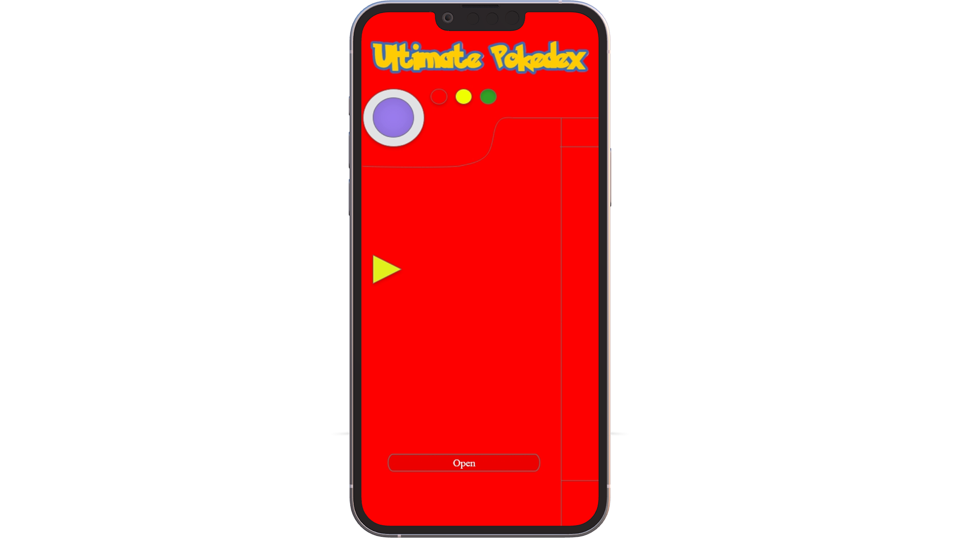
-Landing Page-
The landing page is designed to visually look like the original Pokedex from generation I. The purpose is to spark a nostalgic feeling in users as it brings back the joy and excitement felt from childhood.
-Choose Your Region-
The "Choose Your Region" screen allows users to select which region they would want to view Pokemon in. Currently, there are 7 regions in the Pokemon Universe.


-Region Pokemon-
Once a region is selected, the user is able to scroll through a list of Pokemon that exist within that region as well ass view the number that the Pokemon is listed in the Pokedex.
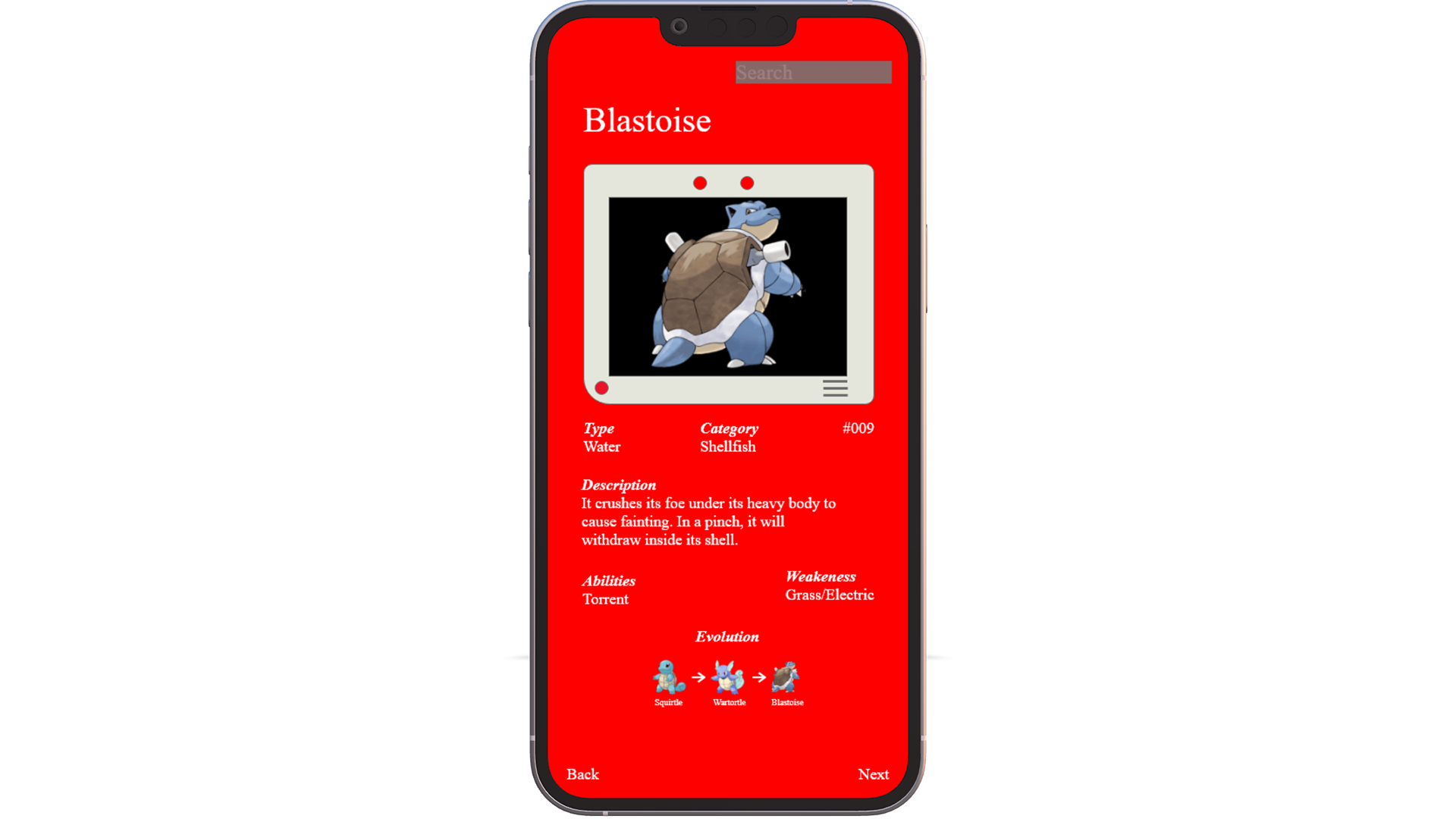
-Pokemon Entry-
After the user selects what Pokemon they want to view, the Pokemon entry displays data about the pokemon such as type, category, entry number, description, abilities, weaknesses, and evolutions if applicable.

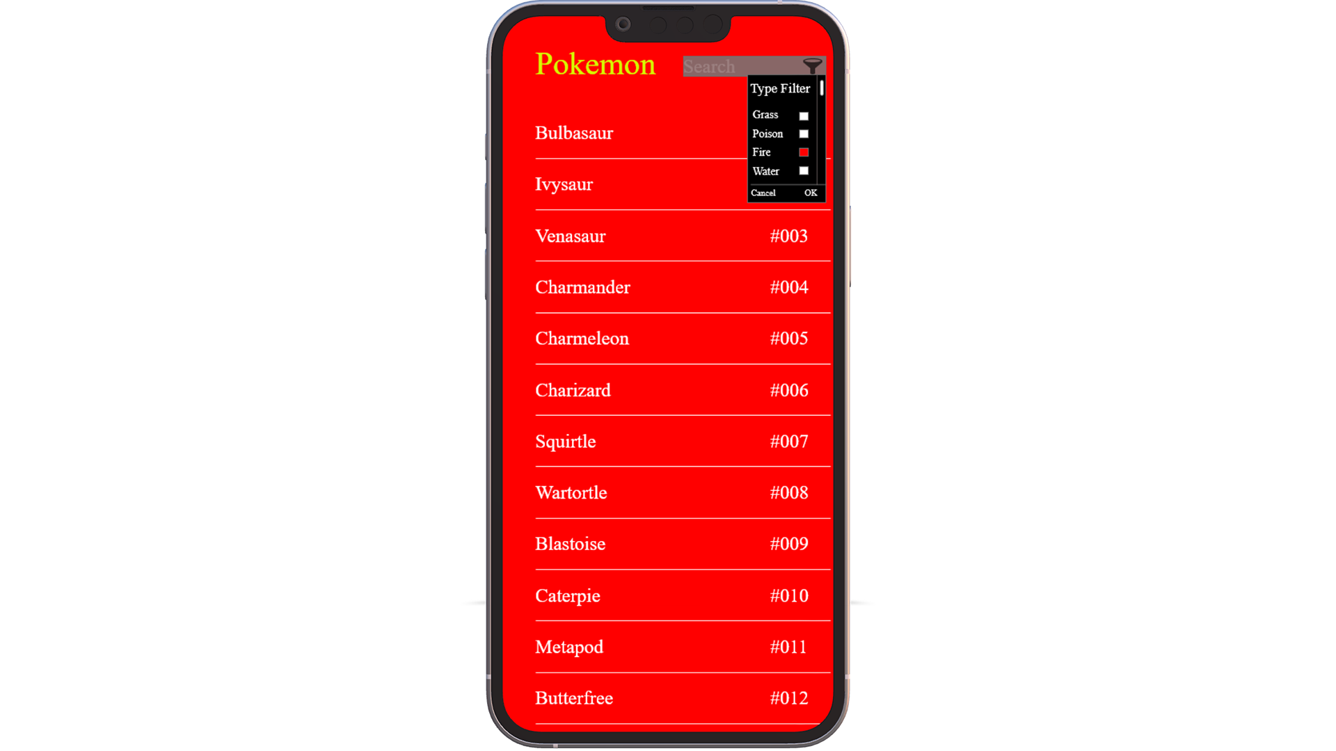
-Filter-
In the search bar, there is a filter option that allows users to filter by pokemon type.
-Filter Select-
When the user decides on what type of pokemon they want to view on the screen, they select the box next to the type name.
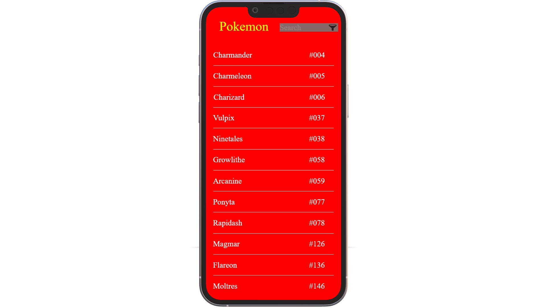
-Filter Results-
Once the user decides on the Pokemon type, they will click the OK button and takes them to a new screen that has the Pokemon that were filtered by type.
Designer Feedback
In order to design the best possible product, I decided to go through a critique process by asking other designers to review on provide comments on the design, layout, and content.
"The readability of the grey text on darker grey for the search button is definitely not accessible. Even with good vision its hard to distinguish for me."
"Those checkboxes look very small and hard to press with your thumb. Try mirroring it to your phone and see how well you're able to press each one individually!"
"On your first screen, consider your entry button/CTA is "open" but its almost indistinguishable on first glance because of how close the reds are. Its a button, you definitely want it to stick out."
Final Designs (Coming Soon)